-
Architects: WORKac
- Year: 2019
-
Photographs:Bruce Damonte
-
Manufacturers: Vitro®, Carritec, Kawneer
-
Lead Architects: Amale Andraos, Dan Wood

Text description provided by the architects. At Rhode Island School of Design’s Student Success Center in Providence, a historic U-shaped, three-story brick building reveals a dynamic and colorful renovation and addition by New York City-based architecture firm WORKac.

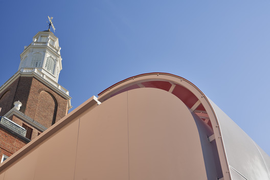
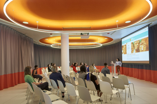
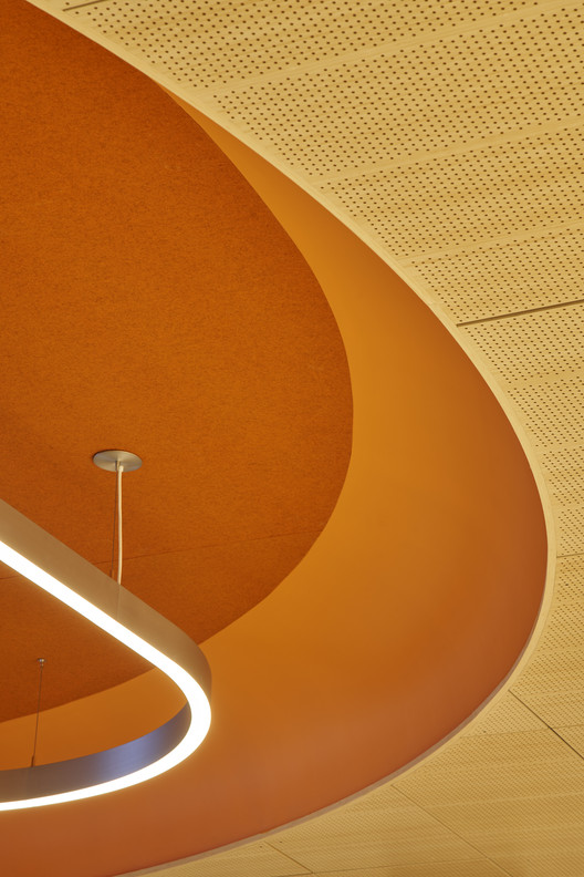
That addition — a rectangular structure inserted into the open section of the “U” — offers two vibrant spaces, a new public face for the building, and an activated streetscape. Half of the addition holds space for mail sorting and pick-up — internet shopping is a central part of college life for Generation Z — and puts packages fully on display, in line with the building’s transparent ethos. Next to this mailroom, WORKac created an auditorium whose sweeping ceiling treatment slides down onto the exterior-facing wall and signals the outer expression of the space: a curved lifting of the addition’s otherwise flat perforated metal skin.

On the building’s southern facade, double glass doors lead to WORKac’s interior intervention, which announces itself as a flash of deep RISD orange. Cross that threshold, and the intervention reveals itself in layers: what is visible in the section of the addition — a perforated wall that lifts to reveal the interior — reappears in the plan in the renovated portion of the structure. A thick wall lifted off the ground and hung from the ceiling winds around the periphery of the entrance hall, its edge marked with the same deep orange that greeted the visitor just a second before. The contour traced by the wall captures two distinct spaces — first, a casual lounging spot right after the entrance door, and then, a more expansive space that eases the transition from the outside to the rest of the building


.jpg?1587760973)
This mixed architectural vocabulary — extrusions combined with subtractions, lines that reveal solidity — lends a playful spirit. Spatial flexibility facilitates interaction between students of a new generation, who, according to WORKac principal Amale Andraos, often consider themselves a part of a singular “shared brain.” Acoustic curtains on pill-shaped tracks — all the curves, with a single exception, are segments of circles — give users a chance to subdivide the space, giving the intervention a sense of purposeful variety.

This same sense of customization drives the rest of the design, as it weaves itself both further within the building’s existing structure and then through it, into the addition. The building’s original design made offices tight and cramped, so WORKac created roomier office spaces for RISD’s Registrar, Office of Financial Services and Career Center, with shared areas between them, preserving a high level of privacy so as to give students an adequate respite from the bustling campus and a comfortable place to discuss often difficult topics.

In the middle of it all, there’s a pause. An all-gender restroom, each stall different in plan shape and color carved out of a solid, lodges itself in the middle of the structure. It’s a subtractive element in an otherwise layered architectural composition, a moment of total independence from the apparent rules. New meets old, and the architecture melts the tension between the two.


.jpg?1587760973)


